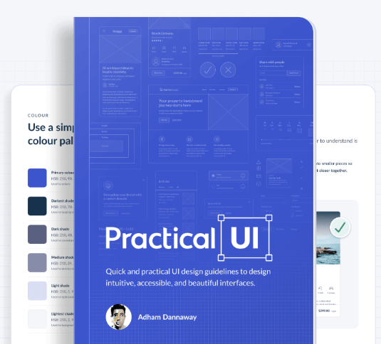
Adham Dannaway – Practical UI – User interface design book

Learn a logic-driven approach to design intuitive, accessible, and beautiful interfaces using quick and practical guidelines.
Gain years of design experience in a matter of hours.
A whole UI design course squeezed into a quick and easy read, packed with actionable guidelines and examples.
Use a system of logical guidelines, rather than just gut feeling.
Interface design might appear to be a magical art form, but a lot of it is made up from logical rules or guidelines.
Much more than just making an interface look pretty.
Learn the how and why behind UI design to ensure that every design detail has a logical purpose behind it.

Problems with the original design
- Icon contrast is too low. Following WCAG 2.1 level AA guidelines, UI elements should have a contrast ratio of at least 3:1 to help ensure people with vision impairments can clearly see them.
- The white space around the image adds unnecessary visual complexity which can increase cognitive load.
- Text contrast is too low, so those with low vision could find it difficult to read. Small text (18px and under) needs a minimum contrast of 4.5:1.
- Colour usage lacks purpose. Blue is used to indicate links, which makes the heading seem interactive. The typeface is also a bit difficult to read due to its complexity.
- Location text is difficult to read as it’s uppercase, low contrast, and has a thin weight.
- It could be unclear to the colour blind that “reviews” is a link, as it’s relying on colour alone as an indicator.
- Icon styles are inconsistent, as some are filled and others aren’t. Icons aren’t labelled, making their meaning unclear. The icon containers also have a similar visual style to the “book now” button, which misleadingly makes them seem interactive.
- The lack of space between groups of content makes the design look cluttered and difficult to understand.
- Multiple issues combine to reduce the readability of the description text: centre alignment, short line height, pure black colour, and short x-height.
- Button contrast is too low, so people with low vision might not identify it as a button. This also confuses the visual hierarchy, as the primary action should be the most prominent element.
Rationale behind the updated design
- Adding a shadow to the icon and a gradient overlay on the top of the image gives the icon sufficient 3:1 contrast.
- Unnecessary visual complexity was removed to decrease cognitive load (the amount of brain power required to use an interface).
- The contrast ratio was increased to 4.5:1 to help ensure it’s legible to those with low vision.
- Blue was removed and the darkest colour shade was used instead for prominence. The typeface was also simplified to a sans serif, as they’re generally the most legible, neutral, and simple.
- To improve readability the location text was changed to sentence case, contrast was increased above 4.5:1, and the font weight was increased to regular.
- Colour and an underline were used to clearly indicate the link to people who are colour blind. Blue was used consistently to indicate interactive elements.
- Icons were outlined with 2pt stroke weight and rounded corners for consistency. They were also labelled for clarity. The blue colour and button styling was removed, so they’re not mistaken for being interactive.
- Increased spacing and borders help to clearly group content, simplifying it and making it easier to understand.
- To improve readability, body text was left aligned, line height was increased above 1.5, and the typeface was changed to one with a tall x-height. Instead of pure black, a lighter colour shade helps to reduce eye strain and correct the visual hierarchy.
- The button contrast ratio was increased above 3:1, which also corrects the visual hierarchy. Blue was used consistently to indicate interactive elements.


Reviews
There are no reviews yet.