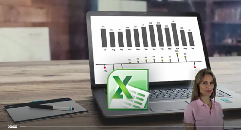
Excel Charts (2010) – Visualization Secrets for Impressive
Charts – Leila Gharani
Without Doubt, With This Advanced Excel Chart Course, You will be the Excel data Visualization star in your Department!
Here’s what you will achieve at the end of the course:
- Significantly improve your Excel reports to create more powerful graphs that communicate your information in the best manner
- Learn creative & simple techniques that allow you to create your own Excel charts from scratch
- Create dynamic Excel charts. Why? To save time! I have seen many cases where people are unnecessarily manually updating graphs. This costs considerable time and nerves.
- Impress your management by including new Excel graphs in your reports (such as my Pin chart for variances)
- Apply Best Practice methods to considerably improve the design of your Excel charts and tables
- Apply techniques that highlight chart and table elements to direct the reader attention where it is needed most
- Use effective Chart Combinations that are pivotal to management reports
- Apply best methods to compare performance in your Excel graphs: as in Actual data versus Budget, forecasts and previous year
- Learn by doing. Download the Demo Excel Workbook and follow each section with me.
- Learn advanced Excel lookup methods (such as matrix lookups) which you can use in your larger data files. The methods learnt in Behind the scenes secrets of dynamic charts can be applied to many other areas.
- Become the Excel data Visualization star in your department by creating impressive Excel charts and graphs in your reports.
You’ll get
- 8.5 hours of video content
- Cheat Sheets – step by step guide to create each chart
- Workbooks, templates and complete solutions
- Full life-time access
- Our friendly teaching assistants to help you out when you get stuck


Reviews
There are no reviews yet.